We Can't Graph Our Way Out Of The Research On Education Spending
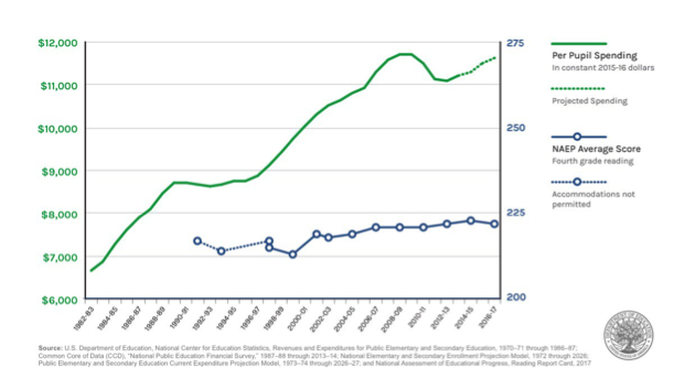
The graph below was recently posted by U.S. Education Department (USED) Secretary Betsy DeVos, as part of her response to the newly released scores on the 2017 National Assessment of Educational Progress (NAEP), administered every two years and often called the “nation’s report card.” It seems to show a massive increase in per-pupil education spending, along with a concurrent flat trend in scores on the fourth grade reading version of NAEP. The intended message is that spending more money won’t improve testing outcomes. Or, in the more common phrasing these days, "we can't spend our way out of this problem."
Some of us call it “The Graph.” Versions of it have been used before. And it’s the kind of graph that doesn’t need to be discredited, because it discredits itself. So, why am I bothering to write about it? The short answer is that I might be unspeakably naïve. But we’ll get back to that in a minute.
First, let’s very quickly run through the graph. In terms of how it presents the data, it is horrible practice. The double y-axes, with spending on the left and NAEP scores on the right, are a textbook example of what you might call motivated scaling (and that's being polite). The NAEP scores plotted range from a minimum of 213 in 2000 to a maximum of 222 in 2017, but the graph inexplicably extends all the way up to 275. In contrast, the spending scale extends from just below the minimum observation ($6,000) to just above the maximum ($12,000). In other words, the graph is deliberately scaled to produce the desired visual effect (increasing spending, flat scores). One could very easily rescale the graph to produce the opposite.
The reality is that NAEP scores increased during the time period depicted in the graph. Now, it’s true that reading scores are not dramatically higher than they were in the 1990s. And, in fourth grade reading, which is depicted in the graph, scores have been flat since 2005. But scores are still higher than they were 25 years ago, by meaningful, if not mind-blowing, margins (as a rough rule of thumb, 10 NAEP points can be interpreted as equivalent to a “year of learning,” though "The Graph's" scaling makes it difficult even to ballpark the size of differences).
Moreover, math scores have increased even more quickly over this time. Now, this progress could be quicker, but real improvement in education is slow and sustained, and there has been improvement. It is a little strange that the U.S. Department of Education, which is nominally in charge of the federal government’s role in education, would deliberately try to obscure that positive fact.
(I would also argue that the fourth grade reading scores are the least appropriate choice of the four “main” NAEP exams because fourth grade scores reflect fewer years of schooling than eighth grade scores and reading skills depend more on out-of-school factors than do math skills.)
But let’s just say the relationship between spending and scores was as depicted – i.e., scores had stayed completely flat since the 1990s and spending had increased dramatically. There is a more serious problem: It is just one big example of sloppy causal inference. I dare say that any high school student could tell you that the coincidence of two trends is not evidence of a causal connection between them. And you needn’t be a school finance scholar to understand that the connection between how and how much states, districts, and schools spend money and how this influences testing outcomes is incredibly complex. Using “The Graph’s” approach, one could prove almost anything.
Luckily for us, there is decades of good research on how spending affects educational outcomes (see our report by Rutgers professor Bruce Baker, or this very well done article, also responding to “The Graph,” which summarizes research published since our report). The short summary of this literature is that, while there are effective and ineffective ways to spend, money matters, and it matters a lot. The graph above, therefore, is not only evidence of nothing, but the conclusions it is designed to impart are actually the opposite of what the research literature suggests (take a look the first graph in this excellent article by Kirabo Jackson, which uses math scores).
So, let’s return to why I am writing about this. Given the current administration, a lot of my friends and colleagues will no doubt look at this graph and say, “What did you expect?”
Call me crazy, but I, like many people, expect a certain level of intellectual rigor and honesty from an institution such as USED. Yes, I know it’s a department run by political appointees, and this is hardly the first time USED has been a little fast and loose with the evidence. I don’t expect long literature reviews and cautious conclusions that end up not taking a concrete policy stance, or Twitter posts accompanied by tables full of coefficients from statistical models.
I do, however, expect more than “The Graph.” I believe that even USED’s most ideological personnel care about evidence and using it to improve outcomes. And they can do better than this. If you want to make causal arguments about what affects NAEP scores, don’t use evidence that can be discredited by students taking a NAEP exam.