Interpreting School Finance Measures
Last week we released the second edition of our annual report, "The Adequacy and Fairness of State School Finance Systems," which presents key findings from the School Finance Indicators Database (SFID). The SFID, released by the Shanker Institute and Rutgers Graduate School of Education (with my colleagues and co-authors Bruce Baker and Mark Weber), is a free collection of sophisticated finance measures that are designed to be accessible to the public. At the SFID website, you can read the summary of our findings, download the full report and datasets, or use our online data visualization tools.
The long and short of the report is that states vary pretty extensively, but most fund their schools either non-progressively (rich and poor districts receive roughly the same amount of revenue) or regressively (rich districts actually receive more revenue), and that, in the vast majority of states, funding levels are inadequate in all but the most affluent districts (in many cases due to a lack of effort).
One of the difficulties in producing this annual report is that the our "core" measures upon which we focus (effort, adequacy, and progressivity) are state-level, and it's not easy to get attention for your research report when you basically have 51 different sets of results. One option is assigning states grades, like a school report card. Often, this is perfectly defensible and useful. We decided against it, not only because assigning grades would entail many arbitrary decisions (e.g., where to set the thresholds), but also because assigning grades or ratings would risk obscuring some of the most useful conclusions from our data. Let's take a quick look at an example of how this works.
The scatterplot below is taken directly from our report. Each red dot represents a state. The measure on the vertical axis is the adequacy of states' spending on K-12 education in its highest poverty districts. More specifically, it represents actual spending divided by the spending level that would be required for the highest poverty districts (i.e., the 20 percent highest poverty districts) in that state to achieve national average test scores (our adequacy "benchmark"). For example, you may immediately notice Wyoming all the way at the top of the plot, at about the 150 percent line. This means that Wyoming spends 150 percent of adequate level (50 percent more). The horizontal blue line is at 100 percent; states close to that line spend at roughly adequate levels for their highest poverty districts.
On the horizontal axis of the scatterplot is state fiscal effort. Effort tells you how much a state spends as a percentage of its total economic capacity (in this case, measured in terms of Gross State Product). It is basically a measure of how much each state prioritizes education -- i.e., how much of its total "economic pie" does it devote to K-12 schools? The vertical blue line represents U.S. average state effort.
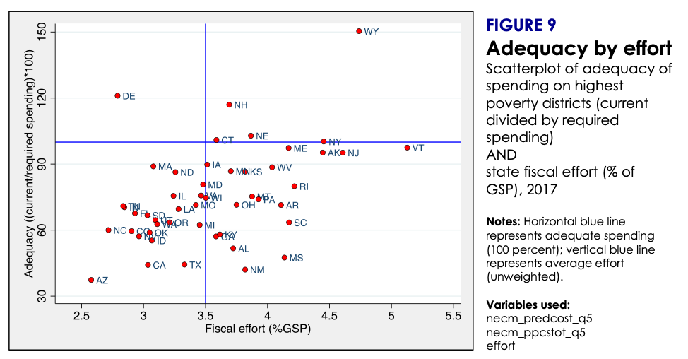
Notice how the red dots in the scatterplot tend to slope upward. This indicates a positive relationship between adequacy and effort. That is, states that put forth more effort also tend to exhibit more adequate spending levels in their highest poverty districts. Wyoming, for example, puts forth very high effort (about 4.7 percent, among the highest of all states), and also has the highest adequacy percentage. In stark contrast, Arizona's effort is the second lowest in the nation (about 2.6 percent) and it spends only about 30 percent of the adequate level. This overall relationship is not entirely surprising -- states that "try harder" to raise revenue spend more adequately, on average.
But no less interesting are the exceptions to this tendency. Let's consider Mississippi (MS), which is located in the lower center part of the plot. Like Arizona's, Mississippi's spending level is far from adequate -- the state spends about 45 percent of the adequate level, among the lowest in the nation. Unlike Arizona, however, Mississippi puts forth very strong effort (about 4.1 percent), among the top 10 effort levels in the nation.
In other words, Mississippi actually devotes a relatively large share of its economy to education, but it falls short on adequacy in no small part because its economy is comparatively small. If, for example, Mississippi's effort level were applied in a state with a larger economy, such as New York or California, it would raise a lot more revenue.
(There are, of course, other, related reasons why Mississippi's adequacy is so low, including the basic fact that its highest poverty districts are even poorer than the highest poverty districts in other states [our poverty quintiles are calculated state-by-state], which means their students will start school further behind, and will require more spending to reach the benchmark of national average test scores.)
Now, let's return to the idea of assigning states overall grades for their school finance systems. If we rated states, Mississippi would score poorly on adequacy for reasons largely beyond its control, and despite the fact that its effort levels demonstrate a commitment to funding schools, one which is severely hampered by the size of its economy (and poverty among its students). Assigning grades would provide a distorted view of the situation.
Conversely, there may be states where effort levels are relatively low but their economies are large enough to produce adequate revenue. Connecticut, for instance, exhibits rather middling effort (just above the national average) but its spending is adequate, even on its highest poverty districts. This is in part because its economy is large. Put simply, Connecticut doesn't necessarily have to put forth high effort, because its economy is large enough to generate sufficient revenue even at the average effort level. Once again, assigning a grade would be misleading.
Basically, school finance measures are interrelated and context-dependent. Now, to be clear, the SFID is specifically designed to allow interstate comparisons by controlling for factors, such as poverty, district size, labor market costs, and other factors that affect the value of the education dollar. And we have deliberately chosen to focus our annual report on three measures -- effort, adequacy, and progressivity -- that we feel provide a pretty good overview of states' school finance systems. These are sophisticated measures that we have tried to present in an accessible fashion, precisely because we want users of the data to compare states. In this second edition of the report, we have even made some effort to calculate national averages of our indicators, and examine trends in those averages.
But it is important to consider all three measures at once (and how they are related), and to pay some attention to state context. From this perspective, our measures are not well-suited for the kind of simplistic, reductive assessments of "good and bad" that are implied by letter grades or ratings. And the grades may discourage users from the kind of multifaceted interpretation that finance data require.
This is the major reason why our primary goal in producing the SFID is to get people to use the data themselves. Our state database includes not only our three core indicators, but also a variety of other measures, in some cases going back decades, including resource allocation indicators (e.g., teacher pay competitiveness, staffing ratios, etc.). This state database is freely available to download on the SFID website, in either Stata or Excel format. The website also includes user-friendly documentation of the datasets and online data visualization tools for users to analyze the data themselves. Our hope is that these data will improve the debate and research on school finance in the U.S., one user at a time.