PISA For Our Time: A Balanced Look
Press coverage of the latest PISA results over the past two months has almost been enough to make one want to crawl under the bed and hide. Over and over, we’ve been told that this is a “Sputnik moment," that the U.S. among the lowest performing nations in the world, and that we’re getting worse.
Thankfully, these claims are largely misleading. Insofar as we’re sure to hear them repeated often over the next few years—at least until the next set of international results come in — it makes sense to try to correct the record (also see here and here).
But, first, I want to make it very clear that U.S. PISA results are not good enough by any stretch of the imagination, and we can and should do a whole lot better. Nevertheless, international comparisons of any kind are very difficult, and if we don’t pay careful attention to what the data are really telling us, it will be more difficult to figure out how to respond appropriately.
This brings me to three basic points about the 2009 PISA results that we need to bear in mind.
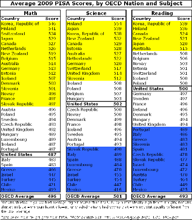
The first is that the U.S. is not among the worst-performing developed nations. We are, on the whole, average. The “evidence” for our dismal performance is, almost invariably, expressed in terms of national rankings. Out of 34 OECD nations, we rank 14th in reading, 17th in science, and 25th in math. These figures are certainly alarming, but what do they really mean?
As it happens, rankings are often among the worst ways to express quantitative data. Not only do they ignore the size of differences between nations (two nations with consecutive ranks might have hugely different scores), but they also tend to ignore error margins (part of the differences between nations are simply random noise, so nations that are far apart in rank might really be statistically indistinguishable). As is the case with value-added, characterizing PISA scores without accounting for error is almost certain to mislead.
When you account for the error margins and look at scores instead of rankings, the picture is different. In the table below, I present PISA scores for OECD nations, by subject. For each subject, the nations shaded in yellow had scores that were higher than the U.S. average by a statistically significant margin, while the nations shaded in blue were lower. Scores in the unshaded nations were not measurably different from the U.S. (i.e., they are tied with us).

As you can see, there is a lot of “bunching” among nations in the middle of the distribution. For example, while the U.S. “raw” score in science (the center columns) places us at the rank of 17, this distorts the fact that only 12 nations had a score that was significantly higher (in this sense, the U.S. was in a 13-nation tie for 13th place). Similarly, only six OECD nations had a significantly higher average reading score, and 17 had a significantly higher math score.
Once you take these error margins into consideration, it also becomes clear that the U.S. scores are indistinguishable from the average OECD scores in reading and science, while our math score is below average by a small but significant margin. Now, these results are definitely cause for serious concern, and there are other breakdowns in which U.S. performance is worse (e.g., how our highest-scoring students do versus those in other nations). They do, however, represent a rather different characterization of U.S. performance than the raw rankings alone, which are all that most people hear about.
So, needs a lot of work? Absolutely. A “Sputnik moment?" Not exactly.
The second point to keep in mind is that U.S. scores actually improved in two subjects. One of the more positive developments in education policy over the past decade or two has been a shift in focus from absolute scores to growth. The idea is that schools with relatively low average scores need not be considered failing if they exceed expectations in boosting their students’ performance every year. Rather, they are often considered successful. This same standard might apply to PISA as well.
And the new 2009 math and science scores are higher than they were in 2006 (the last PISA round) by a statistically significant margin (though the math scores are not higher than in 2003, because there was a drop between 2003 and 2006). There are no 2006 data for U.S. reading (due to a printing error in the test booklets), but reading scores are not statistically different from 2003 or 2000.
It’s therefore somewhat misleading to say that we’ve gotten worse. Overall science and math scores actually improved since the last administration of PISA.
Again, the fact that some U.S. scores increased hardly means that we can spike the ball and do an end zone dance. Reading scores are flat, while the increase in math only served to get us back to our 2003 level (and it’s below the OECD average). And, of course, we’re still way behind the highest performers in all three subjects. But it does show that there has been some discernible progress in math and science (which may generate benefits for economic growth), and this was scarcely acknowledged in the coverage of the results.
The third and final point is oft-discussed, but it is also the most important: U.S. students are demographically different from those in many other OECD nations, and comparing countries en masse is basically an exercise in inaccuracy. For instance, our child poverty rate is almost twice the OECD average, and the proportion of our students who are not native English speakers is also high. There are also institutional differences, such as those between welfare states. We all know how important these and other social/economic factors are, and this is clear in how we quantitatively assess charter schools and teachers – by trying to compare them to schools and teachers with similar students. Yet we persist in comparing apples and oranges when talking about PISA.
In order to illustrate how accounting for these differences among students changes the interpretation of results, I fit a quick regression model of PISA scores that controls for child poverty and per-pupil spending (on all services). I include the spending variable to address the efficiency-based argument that we can’t assess the U.S. education system without accounting for how much we spend on education relative to other nations. Keep in mind, however, that this spending variable is not comparable between nations, since we spend money on things (e.g., health insurance) that many other developed countries provide outside of the education system. The poverty and spending variables both come from the OECD website, and they are both from 2007, which is the latest year I could find (due to missing data, four participating PISA nations – Chile, Estonia, Israel, and Slovenia - are excluded).
Before reviewing the results, I want to strongly warn against overinterpreting them. Cross-national differences in performance—and how this performance relates to factors like poverty and spending—are incredibly complex. Even large, micro-level datasets are limited in their ability to uncover this dynamic, to say nothing of my nation-level data (within-nation differences are often as important as those between nations). Moreover, there are dozens and dozens of influential factors that are not included in this model. Thus, the results should be regarded as purely illustrative.
That said, take a look at the graph below. The red dots each represent a nation, plotted by child poverty (x-axis) and PISA score (y-axis). To keep things simple, I use the three-subject average of scores for each nation. The line in the middle of the graph comes from the regression, and it represents the average relationship between scores and poverty level among these nations (controlling for spending). In a sense, it represents the model’s “expected performance” of nations with varying child poverty levels. Nations above the line did better than average, while nations below did worse (though the nations very close to the line on either side are probably within the error margin, and should therefore be considered average in this relationship).

The downward slope of the line clearly indicates a negative association (not necessarily an “effect”) — the higher a nation’s child poverty level, the lower its scores tend to be. According to this relationship, a nation with the poverty level of the U.S. would tend to score around 480, whereas the U.S. score is around 10 points higher. Therefore, given our poverty level, and even when we control for spending, U.S. performance may be seen as very slightly above average (again – only according to these purely illustrative results).
Similarly, Poland and Finland, which have a roughly 20 percentage point difference in poverty, also score above what the model “expects” (even more so than the U.S.). By contrast, Norway, which has an extremely low poverty rate, scores well below the line. So does Mexico, which has a child poverty rate that is roughly as high as in the U.S. and Poland, but which scores much, much lower. (Side note: These results don’t change much if Mexico is removed from the analysis.)
Yes, my methods are crude compared with the complexity of the subject, but even this very partial accounting for cross-national differences paints a somewhat different picture of U.S. performance (and that of some other nations) than what we’re used to hearing. Moreover, the strong relationship between poverty and performance appears pretty obvious, but high poverty is no guarantee of failure, just as low poverty is no guarantee of success.
So, we still lag way behind the world’s highest performing nations (especially in math), but characterizing the U.S. as completely dismal is kind of like saying that the average KIPP school is a failure just because it gets lower overall test scores than do schools in an affluent suburb nearby. You can't compare student performance without comparing students, and we should stop doing so without qualification.
Given the “sky is falling” rhetoric that accompanied these latest PISA results, it’s hard to shake the feeling that some people have a vested interest in portraying the U.S. education system as an across-the-board failure. They have policy preferences which gain strength if policymakers and the general public believe that our current system is among the worst in the world. Or perhaps they just fear complacency, as we all should.
Whatever the case, propagating mass, simplistic comparisons of U.S. test scores with those of other nations is misleading and counterproductive, plain and simple. It’s hard enough to compare nations using thorough, sophisticated analysis (there should be plenty available for this round of PISA, and there’s already some good stuff in the official OECD report). So, let’s stop with the sound-byte comparisons of rankings and the overly alarmist rhetoric about Soviet satellites.
Nobody is satisfied with mediocrity. The case against it is strong enough to stand on its own. We need a lot of improvement, but we should also be as clear as possible about where we started from.
Thanks for posting a detailed analysis.
Regarding child poverty, what's your definition of child poverty? Households living below $21.2k for a family of 4? Remember that being poor in America is a lot better than being poor in many other countries - even in OECD ones. The percentage of families in poverty in Britain may be lower than in the US, but everything they have to buy (food, clothes, transport) costs them a lot more (in real terms and when adjusted for PPP).
You mentioned that a large percentage of children in the US are English learners. That's true, but they have an more resources at their disposal in the US to help them learn more quickly. For example, broadcast television is free in the US. Many of my friends in non-English speaking countries became fluent in English by watching old subtitled American TV shows. In many OECD countries people must pay an annual fee for broadcast television, or else face draconian fines. (The TV licensing bureaus use triangulation to find unlicensed televisions). Also, the US has the best network of public libraries I have ever seen. They are free to use, and offer books, audio tapes and internet access to help people who need to learn English.
Also, while you raised the English-learning issue in the US, you forget that many OECD countries require children to learn at least one non-native language. So in addition to beating the US in maths, science and reading, many foreign children will learn English too. In fact, some countries (e.g. Switzerland) teach children to be *fluent* in more than one language. American children are typically not burdened with the challenges of learning another language. In theory, they get to focus more time and energy on the things that the PISA test scores reflect.
Thanks for your comment, Antun.
I used the OECD child poverty variable, which most certainly, as you point out, means different things in different nations due to institutional and other types of variation between countries. I’ve actually done a lot of non-education work on one of these factors, which you mention (and so do I, in the post) – cross-national differences in welfare states (exciting, I know).
I agree with the thrust of your arguments. Actually, they reflect one of the primary points of this post: that cross-national comparisons are fraught with complications, even with the best data, and we therefore need to be careful about making sweeping overall comparisons without qualifications. With my little analysis, I was trying to show how even a minimal accounting for these differences can change the conclusions one draws.
That’s also why I made an (almost annoyingly repetitive) effort to caution against making too much of my results – because of, among other things, the bias from omitted variables and institutional differences between nations that you point out.
Your argument about other nations’ requiring multiple languages – and how it might be seen as giving an advantage to American children who need learn only one – is one that I haven’t heard before.
Thanks again,
MD
I have an overall general bias in favor of not highlighting poverty so much in the education conversation. It almost has the feel that if we could only eliminate the kids subject to poverty from our results, we would look much better and thus feel much better about ourselves. I know you and others don't mean it that way but that is how it lands on me. I know that being poor has very distinct disadvantages. I also know of the strong correlation that has for years existed and been recognized between achievement and poverty. My concern is the constant focus on poverty as an explanation almost makes it a red herring. Most of the commentary of this nature will usually end with the obligatory we can do better stuff. But it still feels like you are telling me "if you were not on my back, I could do a whole lot better." Instead, the sentiment should be "you are my brother, and we are in this together." I also understand your point regarding how some with a special interest always seize upon this type of data and spin it for their narrow purposes. And I can't blame you for defending a position as you see it.
It is just that I started from very humble beginnings and education was my tool for personal improvement. And, it can work the same for many, many others that are currently in my old shoes. I would hate to see poverty become a distraction. Thanks for listening.
Thanks for your reply Matthew. My comment that American kids were typically not "burdened" with the challenges of learning another language was partially tongue-in-cheek.
One could argue that encouraging kids to learn foreign languages is beneficial to their performance in other subjects. My own child starts kindergarden next year, and we're leaning towards an immersion program for him, so I wouldn't need any convincing on that point.
Lou, your comment represents the kind of honest discourse that we should be having about the poverty/education relationship, which runs beneath the surface of almost every education conversation occurring today. And I understand what you’re saying. In my posts, I tend to raise the poverty issue only when it is inappropriately ignored (as in the case of PISA). However, I also acknowledge that I believe that addressing education without addressing poverty, or vice-versa, is addressing neither very effectively.
But you’re still correct that it shouldn’t be a distraction, and I think almost everyone agrees – most of the discord is misunderstanding, and there is blame to go around. Just as you interpret my discussion of poverty in a way that I did not anticipate or intend, teachers interpret the “reform” message in a way that the messengers don’t anticipate or intend.
The miscommunication is not usually deliberate, and almost never out of malice, but it happens every day (on both sides). Think about it – you don’t believe (I hope) that I intend to use poverty as a distraction, but your “gut reaction” says otherwise. I have the same experience all the time.
For my part, when I raise the poverty issue, I try to make it clear that, while background factors are the dominant factor overall, economic circumstances do not explain away educational performance, and vice-versa (keep in mind that this was one of my conclusions in this post). Apparently, I do not always achieve this clarity, but I’ll keep trying (no excuses!).
Thanks, I hope you keep reading and letting me know when I get on your nerves.
MD
One more point on poverty:
The correlation between individual and community poverty and student achievement is higher in the U.S. than in most other OECD countries. This is, at least in part and perhaps almost in total, because of how we and they choose to fund schools.
In the U.S., school funding is largely a result of local / state tax systems, which often are built on land taxes. Students going to school in affluent areas (ex., Montgomery and Howard counties, Maryland), often have twice or more spent on their public educations as students in high poverty contexts (almost any district in Mississippi, for example).
By contrast, in the Netherlands, every child, nationwide, gets a fixed national investment in their education, with exceptions being given for poverty (a child's school gets and additional 25% for that child) or speaking a second language in the home (more than 50% extra). This is the opposite of what we do, and it results in national statistics showing less relationship between being born poor and academic achievement.