Recent Trends In The Sources Of Public Education Revenue
Every year, the U.S. Census Bureau issues a report on the overall state of public education finances in the U.S. There is usually a roughly 2-3 year lag on the data – for example, the latest report applies to the 2011-12 fiscal year – but the report and accompanying data are a good way to keep an eye on the general education finance situation both in individual states as well as nationwide, particularly among those of us who are somewhat casual followers (though it bears keeping in mind that these data do not include many charter schools).
One of the more interesting trends in recent years is the breakdown of total revenue by source. As most people know, U.S. public school systems are funded by a combination of federal, state and local revenue. Today, although states vary considerably in the configuration of these three sources, on the whole, most funding comes from state and local revenue, with a smaller but still significant contribution from federal government sources (total revenue in 2011-12 was about $595 billion).
But there has been some volatility in these relative contributions over the past few years (at least the past few years for which data are available). The graph below presents the percent of total elementary/secondary education revenue from federal, state and local sources between 1989-90 and 2011-12.
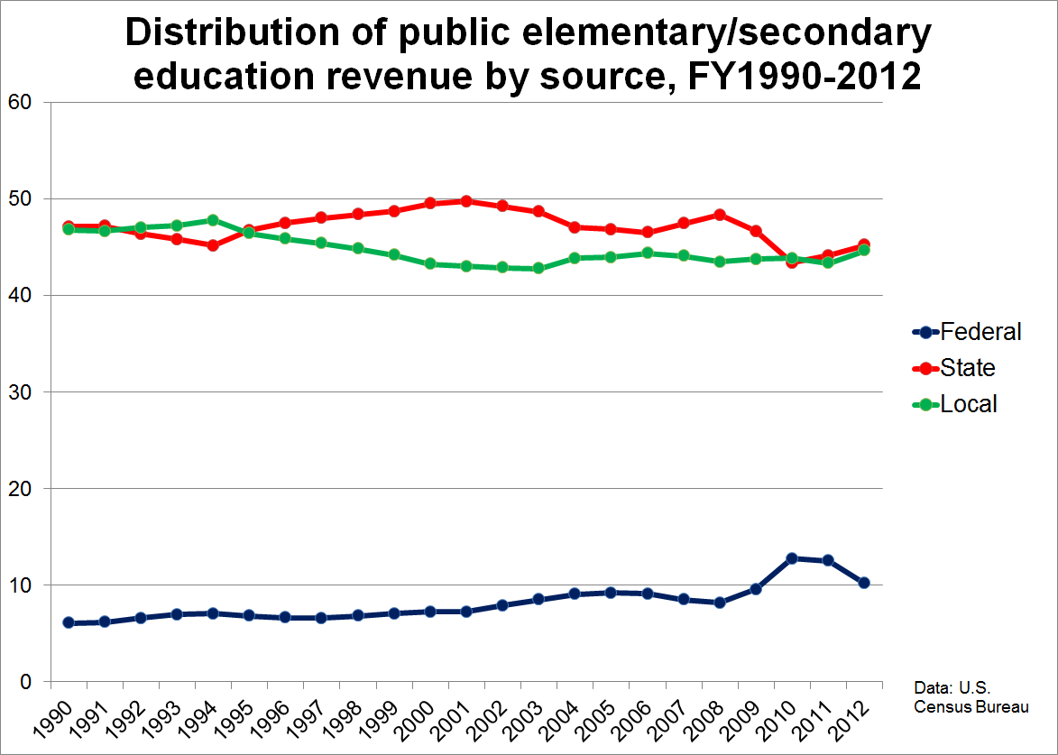
During most of the twentieth century (not shown in the graph), local revenue (primarily property taxes) was the dominant source of school funding. This all started to shift during the 1970s, and state funding eventually came to represent a larger share than local. In more recent years, as you can see in the graph, the proportion of total revenue coming from state (red) and local (green) sources was relatively equal in the early to mid 1990s, and began to diverge in 1995, when state revenue began to increase as a proportion of total revenue, and remained the largest source throughout most of the 2000s.
The recession, however, changed all that, at least temporarily. Between 2008 and 2010, there was a rather substantial dip in states’ relative contribution between 2008 and 2010, due to cuts in funding by states dealing with huge budget deficits. These cuts are still being felt today. Local revenue also suffered during this time, but many localities (at least those that could afford to do so) made up the shortfalls by boosting property taxes. And, finally, as you can see in the blue line, there was a concurrent rise in the proportion of revenue from federal sources. There were (mostly "stimulus package"-funded) increases across the board – for special education programs, Title I, child nutrition, and, of course, programs such as Race to the Top.
What these most recent data make clear, however, is that this spike in the federal government’s relative contribution to total education revenue may have reversed itself, as there was a pretty sharp drop in the percentage between 2011 and 2012 (though, as you can see in the graph, the federal contribution has been rising slowly for a while). And the decrease is due almost entirely to an actual decline in federal dollars, rather than an increase in state and local revenue. It is also the primary reason why total non-adjusted education revenue declined slightly between these two years.
It remains to be seen how this will play out in future years - the next Census finance report should be released within a couple of months. In any case, it is clear that the recession not only took a rather severe toll on local and especially state education revenue, but it also generated a pretty large, albeit short-term shift in the relative contributions of local, state and federal sources, one that may or may not have lasting repercussions for how we fund our public schools going forward.