Actual Growth Measures Make A Big Difference When Measuring Growth
As a frequent critic of how states and districts present and interpret their annual testing results, I am also obliged (and indeed quite happy) to note when there is progress.
Recently, I happened to be browsing through New York City’s presentation of their 2014 testing results, and to my great surprise, on slide number four, I found proficiency rate changes between 2013 and 2014 among students who were in the sample in both years (which they call “matched changes”). As it turns out, last year, for the first time, New York State as a whole began publishing these "matched" year-to-year proficiency rate changes for all schools and districts. This is an excellent policy. As we’ve discussed here many times, NCLB-style proficiency rate changes, which compare overall rates of all students, many of whom are only in the tested sample in one of the years, are usually portrayed as “growth” or “progress.” They are not. They compare different groups of students, and, as we’ll see, this can have a substantial impact on the conclusions one reaches from the data. Limiting the sample to students who were tested in both years, though not perfect, at least permits one to measure actual growth per se, and provides a much better idea of whether students are progressing over time.
This is an encouraging sign that New York State is taking steps to improve the quality and interpretation of their testing data. And, just to prove that no good deed goes unpunished, let’s see what we can learn using the new “matched” data – specifically, by seeing how often the matched (longitudinal) and unmatched (cross-sectional) changes lead to different conclusions about student “growth” in schools.
To keep this as simple as possible, I used the new data from the New York State Education Department to sort schools into one of three categories:
- Increase between 2013 and 2014: Rates increased by one percentage point or more;
- Decrease between 2013 and 2014: Rates decreased by one percentage point or more; and
- Flat between 2013 and 2014: The rate change was either zero or less than one percentage point, positive or negative.
This exercise is repeated using both the cross-sectional and longitudinal data, which means that each school receives two designations - one for each type of data. (The idea of employing an “error margin” or +/- one percentage point is to avoid overinterpreting small changes that are most appropriately considered flat.)
The table below lists the percentage of New York State schools for each combination of “change categories.”
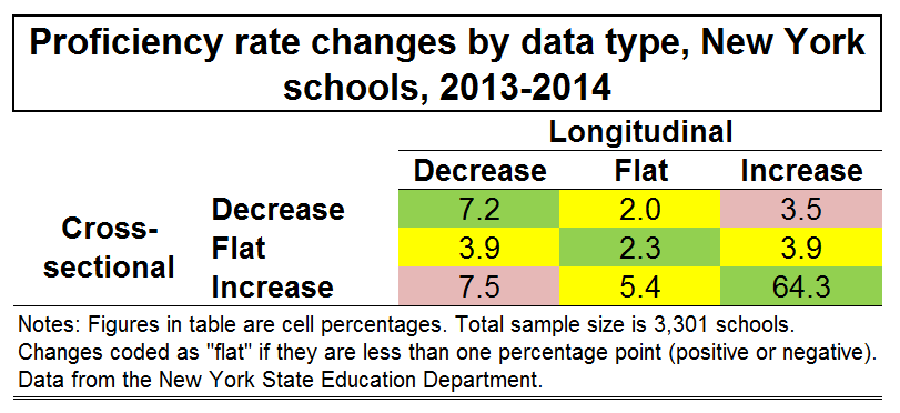
The cells shaded in green present the percentage of schools that received the same category on both measures. For example, in the upper left hand cell, you can see that 7.2 percent of NY schools exhibited a decrease using both the cross-sectional and longitudinal data. Similarly, in the lower right hand cell, 64.3 percent of schools increased on both measures. If you add these two percentages, along with the percentage of schools that were flat on both measures (2.3 percent of schools), you find that almost 74 percent of schools got the same results on both measures. So, as expected, given that school-level samples do overlap quite a bit between years, the changes do match up in most cases, at least when characterized in this manner (see Glazerman and Potamites 2011 for a more thorough comparison).
This, however, also means that one in four schools fell into different categories depending on whether or not the data are longitudinal or cross-sectional (the sum of all cells shaded in yellow or red). In other words, anyone who was (inappropriately) drawing conclusions about student “growth” based on the standard NCLB-style changes in aggregate proficiency rates would have a pretty good chance of reaching a different conclusion using data that actually measured “growth." In addition, for 11 percent of schools (the cells shaded in red), the rates moved in opposite directions.
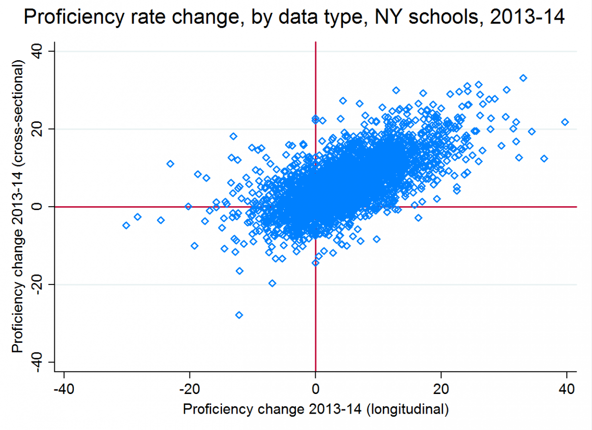
And bear in mind that this isn't even counting differences in the magnitude of changes. The scatterplot below presents the same data in a different format. Each blue dot is a school. The dots in the lower left quadrant are those whose longitudinal and cross-sectional rates both decreased. The dots in the upper right quadrant exhibited increases in both rates. All the dots -- about one in four -- in the other two quadrants (upper left and lower right) were schools in which the rates moved in different directions. You can see that there is a fairly strong correlation (0.66) between the cross-sectional and longitudinal changes, but there is also a lot of variation. The average absolute difference between these two measures is about four percentage points, which is well over half as large as the average absolute change in either measure between years.
To understand these discrepancies, let’s say you measure the average height of your ten tomato plants every Monday in order assess their growth rate, and you find one Monday that your shortest plant had died at some point during the week. If you really wanted to measure growth over the course of that week, you would have to limit your sample to the nine plants that were alive at both measurement points. If, on the other hand, you decided to calculate the average height among your remaining nine live plants, and compared it to the average height from last week (when there were 10 plants), you would find an unusually large weekly increase due to the death of the shortest plant. But you wouldn’t conclude that your plants had somehow undergone a growth miracle. That would be ridiculous - your sample of plants had changed. Yet that is the basic assumption of most school accountability measures in the U.S.
Similarly, every year, a cohort of students enters the tested sample (in K-6 schools, for instance, this is third graders), while a cohort exits the sample (in K-6 schools, 6th graders). As illustrated in this post, even if students in a given school are making huge progress every year, schoolwide proficiency rates or scores can remain flat because of this rotation of cohorts in and out of the tested sample. In addition, differences between cohorts (e.g., third graders in one year scoring more highly than their predecessors the previous year), as well as student mobility in schools, can also generate incomparability between years, and lead to the “illusion” of growth or stagnation.
This certainly is not to say that comparing cross-sectional proficiency rates between years is useless. It allows one to assess whether students in one year are performing at higher levels than students in the previous year, and that can be useful information. But this is very different from assessing whether students in the school exhibited improvement during their time in attendance, since many were only in the tested sample for one year of the time period in question.
Of course, the longitudinal changes presented above do have limitations – for example, the conversion of actual test scores into proficiency rates introduces a great deal of distortion into the data (and, in states where scale scores are comparable between grades, officials should consider releasing the "matched changes" using scores as well as rates). And they must be interpreted with caution - for example, in approximating schools' test-based effectiveness, one should account for differences in student characteristics and other factors.
Nevertheless, because they follow students over time, the longitudinal data actually tell us something about whether students in a school are making progress, for the exceedingly simple reason that you cannot measure growth unless you follow the same group of potential growers over time.
And the very simple analysis presented above illustrates just how much of an impact failure to recognize this basic reality can have on the conclusions one reaches. So, the next time you hear anyone portray cross-sectional score or rate changes as “growth” or “progress,” particularly at the school level, keep in mind that there is a decent chance they are reaching the wrong conclusions. Hopefully, more states will follow, or have already followed, New York’s example, and are planning to actually publish the data necessary for reaching the conclusions they have been reaching incorrectly for many years.