What Should The Results Of New Teacher Evaluations Look Like?
In a previous post, I discussed the initial results from new teacher evaluations in several states, and the fact that states with implausibly large proportions of teachers in the higher categories face a difficult situation – achieving greater differentiation while improving the quality and legitimacy of their systems.
I also expressed concern that pre-existing beliefs about the "proper" distribution of teacher ratings -- in particular, how many teachers should receive the lowest ratings -- might inappropriately influence the process of adjusting the systems based on the first round of results. In other words, there is a risk that states and districts will change their systems in a crude manner that lowers ratings simply for the sake of lowering ratings.
Such concerns of course imply a more general question: How should we assess the results of new evaluation systems? That’s a complicated issue, and these are largely uncharted waters. Nevertheless, I'd like to offer a few thoughts as states and districts move forward.
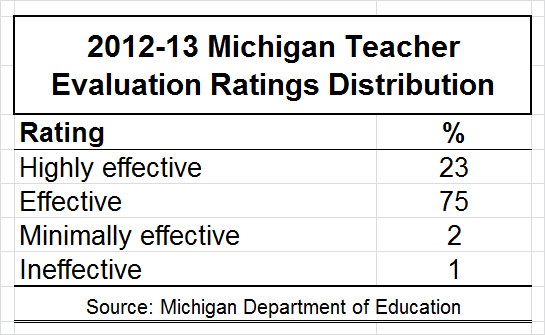
Statewide results mask a great deal of underlying district-level variation in results and design/implementation. This may be an obvious point, but it's worth noting: The new systems' results vary within and between states, as should interpretations of and expectations for those results. For instance, the first round of ratings in Michigan, one of the states that received criticism, were as follows:

Clearly, the fact that three percent of teachers received the “minimally effective” or “ineffective” ratings is implausible, and must be addressed. However, the systems, as well as their actual results, vary quite a bit from district to district. The most useful first step here would be to look for associations between districts’ results and the design of their systems.
Expectations about the distribution of ratings across categories must consider the "meaning" or "intention" of the categories. It’s reasonable to assume that “true” teacher performance, which we cannot observe directly, approximates a “normal distribution” or “bell curve” – that is, most teachers are clustered around the average, and there are fewer and fewer teachers as one moves in either direction.
That does not, however, mean that the evaluations' scoring systems are (or, perhaps, should be) designed to split up teachers in a manner that produces a specific type of distribution across rating categories. For one thing, even if there's a good spread across categories, this doesn't necessarily mean that the underlying scores are "accurate." Moreover, in order to assess the results of the new evaluations, one should first consider what the categories are designed to capture, and how/whether the underlying scoring of each measure matches up with that intention.
And, again, the choice and scoring of measures varies widely, within and between states. Staying with the example of Michigan, districts were able to choose their own assessments and observation protocols (e.g., Danielson, etc.), including those that were already in place prior to the evaluation law, while the weight assigned to "student growth" measures varies widely by district, ranging from 10 to 50 percent. In short, the ratings carry very different meanings from district to district, and expected results should therefore vary as well. The same goes for variation between states.
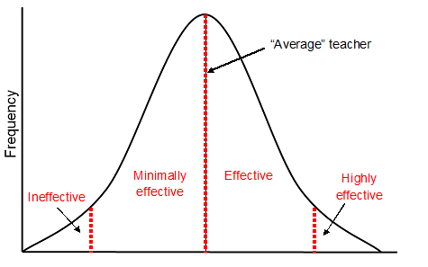
To (somewhat crudely) illustrate this idea, the bell curve (the solid black line) represents the distribution of “true” teacher performance (which, again, we cannot measure directly). The line down the middle of the bell represents the “average," and the dotted red lines are one possible way to view the “meaning” of a common four-category rating scheme.

In this conceptualization, the “minimally effective” category is supposed to include teachers whose performance is below average but not too far to reach the "ineffective" line, whereas teachers rated “effective” are above average. This basic idea is that the line between “minimally effective” and “effective” is mapped onto the average.
From this perspective, we might expect roughly equal proportions of teachers to fall into these two categories (say, about 40-45 percent each), and then 5-10 percent of teachers to fall into each of the two remaining categories – “highly effective” and “ineffective."
It would be ideal to be able design systems that are capable of differentiating among teachers right in the middle of the distribution. But this is a tall order, not only because these systems are all virtually brand new, but also because what little we know about teacher performance measures – both observations and value-added (LINKS) – suggests that it’s much tougher to separate the “above average” from the “below average” teachers than it is to identify the “highly effective” and “ineffective” teachers.
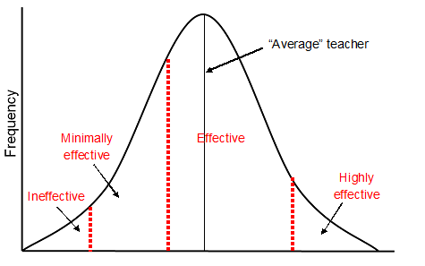
So, districts might choose to conceptualize their categories in a manner more like the figure below.

In this scheme (which, again, is purely for illustrative purposes), the “effective” category is intended to include the mass of teachers clustered around the middle of the “true performance” distribution, while the other categories capture teachers who are assessed to be “far enough” from this middle to warrant separate attention. In this case, it is to be expected that a large proportion of teachers would be rated in the top two categories (or a minority of teachers in “bottom” ratings).
To reiterate, this discussion does not change the implausibility of the three percent of Michigan teachers who were rated “minimally effective” or “ineffective," nor is it intended to advocate for any particular conceptualization of how the categories should be structured. There are pros and cons to any approach.
The point, rather, is that we cannot assess the results of these new systems without first considering what they're supposed to capture, and any conclusions about whether or not they “look right” are based on assumptions about these intentions (as well as whether or not the underlying measures reflect them). This issue is particularly salient when looking at the proportions of teachers falling into the "middle" categories.
In setting expectations for new systems’ results, one might consider the stakes attached to each category. The "proper meaning" of the categories in a given system may be informed by the consequences or rewards attached to receiving them.
For example, the “correct” way to conceptualize the "minimally effective" category -- and to assess the proportion of teachers who fall into that category -- might depend to some extent on whether teachers can be dismissed for receiving a “minimally effective” rating in consecutive years. If so, then it might not make much sense to design systems in which teachers are at risk of being fired simply because their measured performance is judged to be very slightly below average (the first bell curve illustration, above). Instead, districts may wish to set the line a little bit further down (the second bell curve illustration).
If, alternatively, the stakes are lower -- e.g., teachers who receive a “minimally effective” rating are only required to undergo professional development -- then the attempt to “split up” the “minimally effective” and “effective” categories in a manner that is intended to represent “below average” and “above average," respectively, might be more defensible.
The idea here is that what seems plausible or desirable as far as how many teachers receive a given rating may vary quite a bit depending on the stakes attached to that rating. This might be a useful way to help interpret the results.
It is important to remember that differentiation across rating categories is only one of several ways these new systems should be assessed. When we’re looking at the results of these systems, we need to be very careful not to pass summary judgment based on whether the distribution of results is plausible to a particular constituency or the public at large. The potential of these systems is not just about personnel decisions, but it also rests upon their ability to provide useful information to both teachers and administrators.
Without question, differentiation in final ratings matters, but there is a danger that we will miss the improvement forest for the “fire the bottom 5-10 percent” trees.
Equally, if not more important than the final ratings are whether teachers and administrators are getting good feedback about what’s going on in the classroom, and whether they are being trained successfully in how to extract this information from the process and results. Granted, this is more difficult to assess than the plausibility of ratings distributions, but if educators aren’t getting strong information from the evaluations, and/or the systems are not credible among those they are being used to evaluate, they will not work no matter how the ratings turn out.
As I said in a previous post, I fear that some states and districts are going to spend the next decade or so learning that lesson the hard way.
This is unexplored territory; perfecting these systems will take years. Although a few states and districts are implementing new evaluations without so much as a pilot year (foolishly, in my view), we need to be realistic about our expectations during the first few years. We know relatively little about how these measures, such as value-added and observations, should be incorporated into evaluations, and what impact these systems will have.
It is smart and necessary that the early results should guide changes to the systems going forward, but the systems should get better over time, including, perhaps, their ability to differentiate between teachers. Our expectations and interpretations of their results should be calibrated accordingly. Nobody said this would be easy.
- Matt Di Carlo

"Nobody said this would be easy." That is simply not true. Hanushek promised us it would be. So did Michelle Rhee. The ability to tell the difference between an "effective" and "ineffective" teacher was sold as a certainty lighting the pathway toward higher achievement for all students despite their backgrounds. I appreciate your measured approach to this endeavor, but please don't make excuses for those who have misrepresented this enterprise as a sure formula for success -- because indeed they have.
Do we really believe that 50% of teachers are below average and bad? Is the number or percent of excellent teachers equal to the number of "ineffective" teachers? As a past classroom teacher with over twenty years of experience,in five different schools, this was not my observation. I would say that at least 75% of the teachers with whom I worked were effective or above. If they weren't they usually self selected out of the profession early on or were non-renewed before they attained career status in my state.
The other 25% are those who need assistance and some got better and some ended up out of the profession. Some were previously effective teachers who had something happen in their life such as a personal or family illness, family tragedy, or something else that affected their ability to cope with the stress of the classroom.
I think it is very wrong to assign teacher evaluations into any type of preconceived percentages. Even though maybe I just did?