Colorado's Questionable Use Of The Colorado Growth Model
I have been writing critically about states’ school rating systems (e.g., Ohio, Florida, Louisiana), and I thought I would find one that is, at least in my (admittedly value-laden) opinion, more defensibly designed. It didn't quite turn out as I had hoped.
One big starting point in my assessment is how heavily the systems weight absolute performance (how highly students score) versus growth (how quickly students improve). As I’ve argued many times, the former (absolute level) is a poor measure of school performance in a high-stakes accountability system. It does not address the fact that some schools, particularly those in more affluent areas, serve students who, on average, enter the system at a higher-performing level. This amounts to holding schools accountable for outcomes they largely cannot control (see Doug Harris' excellent book for more on this in the teacher context). Thus, to whatever degree testing results can be used to judge actual school effectiveness, growth measures, while themselves highly imperfect, are to be preferred in a high-stakes context.
There are a few states that assign more weight to growth than absolute performance (see this prior post on New York City’s system). One of them is Colorado's system, which uses the well-known “Colorado Growth Model” (CGM).*
In my view, putting aside the inferential issues with the CGM (see the first footnote), the focus on growth in Colorado's system is in theory a good idea. But, looking at the data and documentation reveals a somewhat unsettling fact: There is a double standard of sorts, by which two schools with the same growth score can receive different ratings, and it's mostly their absolute performance levels determining whether this is the case.
Overall, Colorado’s elementary and middle schools are judged based on three components: Absolute performance (basically, proficiency and other cutpoint rates) count for 25 percent; overall growth (using the CGM) counts for 50 percent; and growth among subgroups (e.g., “growth gaps” by income, race, etc., also using the CGM), counts for the other 25 percent. In all three cases, each school is scored in terms of whether it "doesn’t meet," "is approaching," "meets" or "exceeds" expectations, with point totals between 1-4 associated with these designations.
A rough way to check for potential bias is to see if scores on any of these components are related to student characteristics, such as the proportion of a school's students receiving subsidized lunch (an imperfect proxy for poverty). The mere existence of a relationship is not necessarily a problem, as it might simply reflect “real” differences in schools’ effectiveness (and, of course, whether or not a measure is appropriate can vary by how it's used). But an unusually strong correlation for any one component could be a red flag.
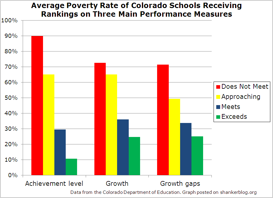
The graph below presents the average school poverty rate (percent free/reduced-price lunch) for elementary and middle schools that receive each of the four ratings, and this association is presented separately for the three major components.
Unsurprisingly, the “achievement level” portion (absolute performance), the bars all the way on the left, appears heavily associated with school poverty. Schools receiving the lowest rating (red bar) for absolute performance have an average poverty rate of about 90 percent, whereas schools that exceed expectations (green bar) have a rate of around 10 percent.
This is to be expected in the case of absolute performance, but the relationship between poverty and the two growth-oriented measures (the two rightmost sets of bars) is also modest-to-strong, somewhat more so than might be anticipated based on past research.**
For instance, schools that “exceed expectations” on the overall growth measure (the green bar in the middle set) come in around 25 percent poverty, whereas those that “do not meet expectations” (the red bar) have average rates about three times as high.
How is this possible? In part, it's because CGM estimates are associated with student characteristics, as we'll see. But the association is significantly exacerbated by the fact that Colorado "translates" schools' growth scores into ratings differently based largely on their absolute performance levels. Two schools might have the same exact actual growth score, but receive a different growth rating on their report cards. Let me explain.
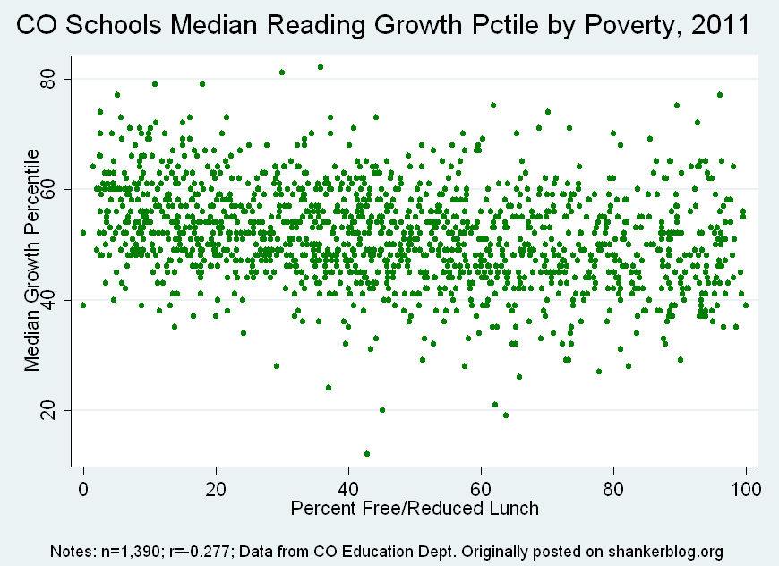
Let’s start by quickly confirming the relationship between schools’ actual growth scores (called "median growth percentiles") and their poverty levels, using reading scores.
This isn’t too bad. High- and low-poverty schools aren’t tremendously different in terms of their reading growth scores (it's even weaker in math). There is some association - a perceptible downward slope in the dots suggests that growth scores decrease as poverty increases. This might be seen as within tolerable limits, but it's certainly something that one should be careful to not make worse.
However, in addition to their actual growth score, each school gets an “adequate growth” expectation, which represents the actual growth score they would need for every student to reach proficiency within three years, or by tenth grade. These hypothetical trajectories are calculated by the state.
If schools don't meet “adequate growth” – if their actual growth scores are lower than the “adequate” expectation – then, put simply, they are docked 10 percentile points, which is a pretty big change relative to the distribution.***
And this is where the additional association between poverty and final growth ratings arises (it's actually between the ratings and absolute performance, which is strongly correlated with poverty).
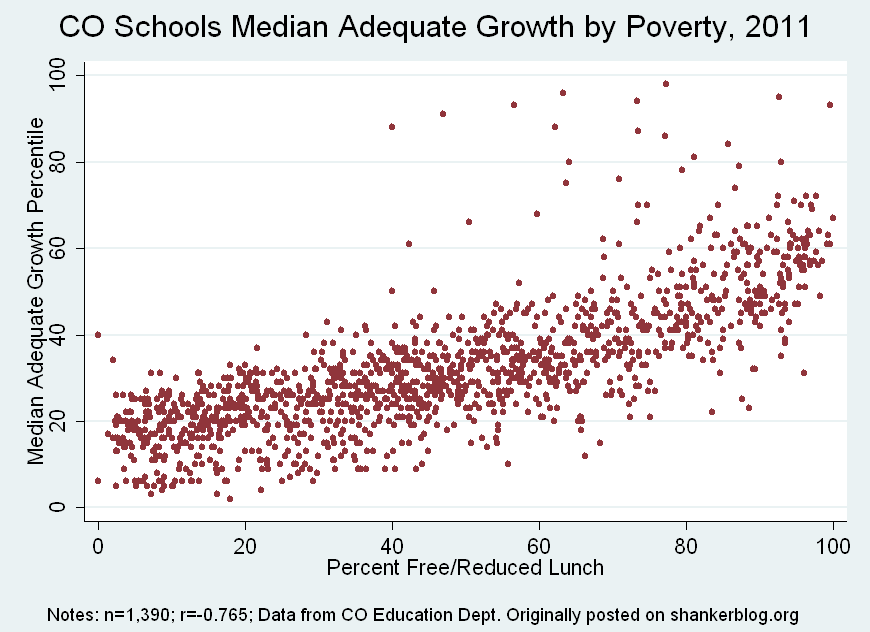
Poorer schools (which tend to have lower absolute scores) will also have higher “adequate growth” requirements, since they need to produce larger gains in order to get all their students to proficiency. This is clear in the scatterplot below, which is simply each school’s “adequate growth” score (again, in reading) by poverty.
Predictably, this is a strong correlation. Most of the lowest-poverty schools need only receive growth scores in the 10-30th percentile range in order to be classified as meeting “adequate growth," compared with 40-60th among the highest poverty schools.
This policy - applying different growth rating scoring systems based largely on absolute performance levels - results in a fairly large number of schools receiving a lower growth rating than they would in a system where all schools are judged by the same standard.
Most of these downgraded schools, as would be expected, are higher-poverty, which generates some (but not all) of the bias evident in the bar graph above. Higher-poverty schools tend to get lower growth ratings in part because there's a double standard (though the extent of this effect should not be exaggerated - actual CGM scores are themselves associated with poverty, as shown in the first scatterplot).****
Don't get me wrong - I would still say Colorado's growth-heavy system is far preferable to its counterparts in most other states, and actual growth scores are still the driving force in the system. But the double standard is a little perplexing. For all their limitations, one of the big advantages of growth models is that they explicitly control for how highly students score at the beginning of the year (or last year), based on the idea that students at different achievement levels (which are heavily correlated with characteristics like poverty) tend to make progress at different rates. This helps ensure that drastic decisions such as closure or "turnaround" are based the quality of instruction schools provide, rather than the characteristics of students they happen to serve.
Yet the manner in which Colorado incorporates growth model estimates – i.e., by tying them to absolute performance-based expectations – not only serves to partially negate these benefits, but also does so in a manner that in some respects contradicts the justification for including growth measures in the first place.
- Matt Di Carlo
*****
* I should mention that, despite its popularity, the Colorado Growth Model is (arguably) not intended to measure actual school or teacher effects. Rather it is supposed to describe student performance – specifically, using quantile regression, determine how high their gains are relative to other students who started out at the same level. Using these estimates in high-stakes decisions is therefore potentially problematic, but this is an issue for a different post. In the meantime, see here and here, here and here for accessible discussion.
** The correlation between student poverty and the actual index number that is used to categorize schools is -0.42 (I presented the categorical averages in the bar graph because there isn't much variation in these index scores). Obviously, this association is not perfectly comparable to previous estimates of the association between MGPs and poverty, since the manner in which the estimates are actually incorporated might influence the raw correlation (this of course turns out to be the case). However, the discrepancy was large enough to catch my eye.
*** Just to give you an idea, roughly three-quarters of schools receive actual reading growth percentile scores between 40-60, so 10 points is quite large relative to the distribution. A quick overview of the scoring: There are two “rubrics” by which actual median growth percentiles are assigned point values (and categories in the first graph). If schools’ actual growth percentiles (which of course range between 0-100) are equal to or greater than their “adequate growth” trajectories, the cutoff points for each final rating category decrease by 10 percentile points (here’s a sample school report that contains rubrics). I might also add that the sorting of schools into arbitrary categories, no matter how it's done, represents considerable unnecessary data loss - schools might have actual growth scores that are extremely similar (even within the margin of error, which is, as usual, completely ignored), but still receive different ratings because they happened to come in above or below the line.
**** The same basic situation applies, albeit in a less straightforward manner, to the "growth gaps" component.


Matt, your comments seem to imply that if a model is *intended* to measure actual school or teacher effects, it's okay to use it for that purpose - otherwise it is not. Why does the CGM have "inferential issues" but other models don't? I think what you have in mind is a causal inference about performance, which is a separate issue from choice of a model, and at which all these models probably fail.
Tillie,
You're correct that my wording seems to imply that, and it was not my intention. All the models are open to scrutiny as to whether they can support causal inference, at either the school- or teacher-level. I didn't want to get into that issue in this post, so I carelessly breezed through it.
Thanks for helping me clarify.
MD
It's not necessarily a problem that low performance on these metrics is correlated with low SES if we believe that low SES students are more likely to have low quality schools.
I appreciate your analysis. One factor you may not have considered is the causal relationship between low SES and lower growth. School quality is the largest factor in student growth, but low SES students tend to have much less support at home. High SES parents tend to devote more resources to their childrens' education. If a high SES student is struggling in a subject, the parents are typically more able to assist with homework and even to find tutoring. A low SES parent is unlikely to have the same resources in time and money. Low SES parents are also likely to be less educated and may tend to value education less highly. This is one reason that median growth percentiles still trend with SES (even within the same school).