School Funding And Equal Educational Opportunity
Equal opportunity is kind of the endgame in education policy. That is, school systems should provide all students, regardless of their backgrounds or economic circumstances, with what they need to achieve minimum acceptable outcome levels.
School funding is a huge factor in the equal opportunity realm, given that virtually all effective education policies require investment. From the finance perspective, states can achieve equal opportunity by allocating funds such that districts with higher costs—e.g., those serving higher-poverty populations—have enough to pay those costs (primarily by using state funds to help districts with less capacity to raise funds locally). In other words, the job of states is to ensure that funding is adequate in all districts.
What we’ve found in the School Finance Indicators Database (SFID), in short, is that there is plenty of educational opportunity in the U.S., but it’s not equal. Let’s quickly visualize some of our SFID data and see how that’s the case.
The SFID is a joint project by ASI and Bruce Baker, Mark Weber, and Ajay Srikanth from Rutgers GSE, and our district adequacy measures allow one to compare actual funding levels with estimated adequate funding levels (i.e., cost targets) for over 12,000 U.S. public school districts across all 50 states and D.C. (see this report, download the full dataset, or check out our online visualization tools to view data for your district or your state).
In the scatterplot below, each circle is an individual district. The size of the circles are weighted by enrollment (bigger circles are bigger districts) The red circles are districts in the highest-poverty quintile (i.e., the 20 percent of districts with the highest Census poverty rates in each state). The blue dots are those in the lowest-poverty quintile. We'll limit this visualization to districts in these top and bottom poverty quintiles.
On the vertical axis is the gap (in dollars per-pupil) between each district’s actual funding level and its estimated adequate funding level; districts below the horizontal black line spend below adequate levels, and those above the line spend more. The horizontal axis is the difference, in standard deviations, between each district’s average test scores (math and reading combined) and the U.S. average; districts to right of the vertical black line score above the national mean, whereas districts to the left score below. These data are for 2018.
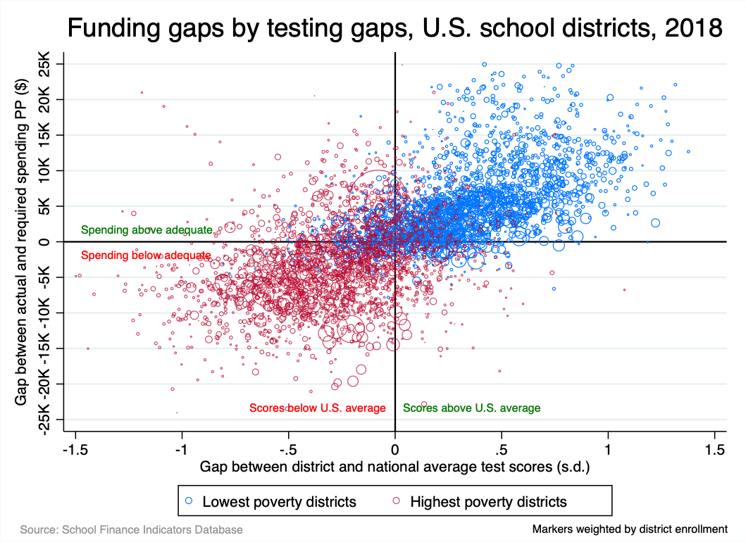
There are a few thousand districts in this plot, and they are rather bunched together, but two things jump out from the figure. The first is the general upward slope of the dots, which indicates the positive association between funding adequacy and testing outcomes. In other words, districts in which funding is more adequate (according to our measures) tend to score higher, relative to the U.S. mean. No surprise: funding matters.
The second big takeaway, of course, is that the lowest-poverty districts (blue circles) are generally getting the funding that they need and scoring above the average, whereas the districts with the largest proportions of low-income residents (red circles) are funded below our cost targets and their students are scoring accordingly.
Just to give a little perspective, the majority (71 percent) of the lowest-poverty blue circles fall into the top right quadrant formed by the black lines (adequate spending, scores above average), whereas only 8 percent of the highest-poverty (red) districts are found in this quadrant. Conversely, 59 percent of the highest-poverty districts fall into the lower left quadrant (inadequate spending, scores below average), compared with only 5 percent of the lowest-poverty (blue) districts.
To be clear, U.S. average test scores is not a particularly ambitious standard. A higher standard would push the dots in the graph down and to the left, but the higher-poverty districts would still be overwhelmingly concentrated in the lower left area of the mass of dots, with the lowest-poverty districts in the upper right. Moreover, our use of average scores for this purpose do not reflect a belief that test scores are perfect measures of student success (or even close). They are, rather, a common “benchmark” that is comparable across districts and states. Finally, these measures certainly don’t imply that, were spending to be raised to our estimated adequacy targets, test scores would quickly and uniformly increase. Our cost estimates are necessarily far from perfect; we can't control for everything, and testing and funding data across ten years in all 50 states and D.C. are subject to imprecision (we have, for instance, particular concerns about New York and Vermont). And, even if our estimates were perfect, real improvement is gradual and requires sustained investment.
That said, this graph illustrates how public school funding in the U.S. embodies unequal educational opportunity. And the consequence is unequal educational outcomes.
This is, as usual, not the case in all states; a handful are quite good (above-adequate spending in all district poverty quintiles), though even in these states there are districts that slip through the cracks. And there are also states in which funding is inadequate due in part to low capacity (smaller economies from which to draw revenue). To no small extent, though, the pattern in the graph above is due to deliberate policy choices, most notably the fact that, in most states, revenue is allocated either non-progressively (high- and low-poverty districts receive roughly equal amounts) or regressively (high-poverty districts receive less).