Making (Up) The Grade In Ohio
In a post last week over at Flypaper, the Fordham Institute’s Terry Ryan took a “frank look” at the ratings of the handful of Ohio charter schools that Fordham’s Ohio branch manages. He noted that the Fordham schools didn’t make a particularly strong showing, ranking 24th among the state’s 47 charter authorizers in terms of the aggregate “performance index” among the schools it authorizes. Mr. Ryan takes the opportunity to offer a few valid explanations as to why Fordham ranked in the middle of the charter authorizer pack, such as the fact that the state’s “dropout recovery schools," which accept especially hard-to-serve students who left public schools, aren’t included (which would likely bump up Fordham's relative ranking).
Mr. Ryan doth protest too little. His primary argument, which he touches on but does not flesh out, should be that Ohio’s performance index is more a measure of student characteristics than of any defensible concept of school effectiveness. By itself, it reveals relatively little about the “quality” of schools operated by Ohio’s charter authorizers.
But the limitations of measures like the performance index, which are discussed below (and in the post linked above), have implications far beyond Ohio’s charter authorizers. The primary means by which Ohio assesses school/district performance is the state’s overall “report card grades," which are composite ratings comprised of multiple test-based measures, including the performance index. Unfortunately, however, these ratings are also not a particularly useful measure of school effectiveness. Not only are the grades unstable between years, but they also rely too heavily on test-based measures, including the index, that fail to account for student characteristics. While any attempt to measure school performance using testing data is subject to imprecision, Ohio’s effort falls short.
Every year, most schools (and districts) in Ohio get one of six grades: Emergency, Watch, Continuous Improvement, Effective, Excellent, and Excellent with Distinction. Schools that receive poor grades over a period of years face a cascade of increasingly severe sanctions. This means that these report card grades are serious business.
The method for determining grades is a seemingly arbitrary step-by-step process outlined on page eight of this guidebook. I won’t bore you with the details, but suffice it to say that a huge factor determining a school’s grade is whether it meets certain benchmarks on one of two measures: The aforementioned “performance index” and the percentage of state standards that it meets. Both of these are “absolute” performance measures – they focus on how well students score on state tests (specifically, how many meet proficiency and other benchmarks), not on whether or not their scores improve. And neither accounts for differences in student characteristics, such as learning disabilities and income.
As I have discussed before, there is a growing consensus in education policy that, to the degree that schools and teachers should be judged on the basis of test results, the focus should be on whether students are improving (i.e., growth), not how highly they score (i.e., absolute performance). The reasoning is simple: Upon entry into the schooling system, poor kids (and those with disabilities, non-native English speakers, etc.) tend to score lower by absolute standards, and since schools have no control over this, they should be judged by the effect that they have on students, not on which students they happen to receive. That’s why high-profile schools like KIPP are considered effective, even though their overall scores are much lower than those in affluent suburbs.
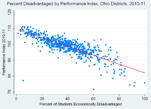
The strong relationship between district poverty and one of these absolute performance measures – the state’s performance index that Fordham’s Terry Ryan discussed – is clear in the graph below, which I presented in a previous post.
With few exceptions, the highest-poverty districts receive the lowest index scores, and vice-versa. One could theoretically account for this relationship - and still measure "absolute" performance levels - by statistically “adjusting” the index scores for school poverty and other variables. Ohio does not.
The fact that these unadjusted “absolute” measures play such a huge role in determining Ohio’s school report card grades (and, apparently, an exclusive role in ranking Ohio’s charter authorizers, a policy I simply cannot understand) carries one inevitable consequence: Even if their students aren’t improving much, schools and districts with relatively few low-income students will get better report card grades, because their students tend to get higher scores. And, conversely, even high-poverty schools whose students are making great progress will tend to receive report card grades that are lower.
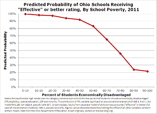
This consequence shows up clearly in the state’s report card grades. For instance, in the graph below, I present the predicted probability of receiving a grade of “effective” or better in 2011 by school poverty, controlling for a few other variables measuring student characteristics (see the figure’s notes).
Lower-poverty schools – those with less than 30 percent of their students classified as “economically disadvantaged” are virtually “guaranteed” a grade of effective or better. Beyond the 40-50 percent disadvantaged mark, higher poverty schools are increasingly less likely to receive this grade, while the highest-poverty schools (80-100 percent disadvantaged) are very unlikely to make the cut. I chose the “effective or better” outcome for easier interpretation, and because “effective” is the lowest grade below which schools face no risk of sanctions. But the same basic situation applies to all the other report card grades, no matter how you model them – poorer schools are much less likely to receive the good grades, and much more likely to receive the bad ones.
It’s certainly plausible that “bad schools” are disproportionately located in high-poverty areas, but it seems impossible that almost all of Ohio’s low-poverty schools are effective, while the vast majority of its highest-poverty schools are not. My analysis and review of the state’s documentation suggests that this is actually a direct result of the prominence of “absolute” performance measures in the formula. In essence, Ohio’s system of school report card grades acts to penalize schools, such as those authorized by Fordham, with higher proportions of poor students.
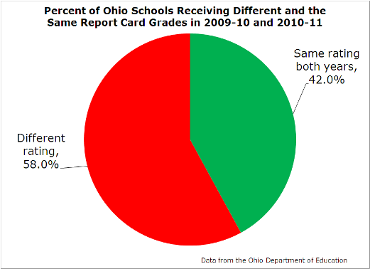
There’s more. One alternative way to assess the “quality” of Ohio’s report card grades is to see how stable they are between years (i.e., whether they are reliable). They’re not particularly stable. As shown in the graph below, the majority (58 percent) of schools got a different rating in 2011 compared with 2010.
Yes, it’s perfectly normal for some schools to get different ratings between years. If they improve, it might even be a good thing. But most schools don’t change their operations that much over a single year, so it’s not unreasonable to expect that most schools which get a given rating in one year will get the same rating the next year. The fact that they don’t does not necessarily reflect some kind of failure of the system, but it is not encouraging.
We don’t need to speculate why there is so much instability – it’s mostly because of the value-added ratings, which are a major component of the report card grades. As I showed in this post, they fluctuate between years, but they don’t “penalize” high-poverty schools. In contrast, the “absolute” performance measures – the performance index and the percent of standards met – are quite stable between years, but they give an unfair "advantage" to more affluent schools.**
So, there’s a trade-off of sorts between the “growth” and “absolute” measures, one that is not at all unusual in education measurement. But there are ways to address it on both ends. For instance, as mentioned above, the “absolute” measures could be easily adjusted to account for student characteristics, while the various formulas and cutpoints used to calculate the formulas could have been more thoughtfully constructed (again, I won’t bore you with details). In addition, the more years of data that are incorporated into the value-added ratings, the more stable they become (unfortunately, effective next year, Ohio will actually be using fewer years of value-added ratings as a "trigger" for up- or downgrades).
Perhaps the people who designed the Ohio system made a good-faith effort to achieve “balance” between the various components – a very difficult endeavor to be sure. But what they ended up with was a somewhat arbitrary formula that produces troubling, implausible results based on contradictory notions of how to measure performance. The grades are as much a function of income and other student characteristics as anything else, and they’re more likely to change than stay the same between years. So, while I can’t say what the perfect system would look like, I can say that Ohio’s report card grades, without substantial changes, should be taken with a shaker full of salt.
Unfortunately, that’s easy for me to say, but parents, teachers, administrators, and other stakeholders have no such luxury. These grades are used in the highest-stakes decisions.
And this brings up a larger, perhaps more important issue about these Ohio grades and similar systems elsewhere: They are based almost entirely on students' test results. We don’t judge students and teachers based solely on test results, so why do so for schools and districts?
*****
** For example, the correlation between the performance index of schools in 2010 and 2011 is 0.95, which is very high (it's similarly strong for the percent of state standards met, at 0.91). But these correlations do vary by school poverty – stability is higher among the lowest-poverty schools compared with the medium- and high-poverty schools. The poverty-based variation in stability is a function of distributions around "benchmark"-based measures. For instance, most of the state standards require that schools have over 75 percent of their students meeting proficiency standards – since most low-poverty schools come in well above that cutoff, they are less likely to see changes in their ratings between years. But, regardless of the reasons why it occurs, there is a potentially-troubling consequence of this dynamic: Ohio’s report card grades are much more stable among the lowest-poverty schools compared with those with medium- to low-poverty rates.
- Matt Di Carlo


These same forces are at work in education.